
Office of Housing: Boston
Office of Housing
Office of Housing
Office of Housing
Rethinking the User Experience for the City of Boston’s Office of Housing including site re-architecture and housekeeping.
We trimmed a sprawling, inconsistent site with 350 pages in half by consolidating content, refining usability, and designing the experience around 7 user personae.

Role
User Experience Designer
Project Lead
Information Architect
Copywriter
Team
IT Management
Web Design
Marketing
Communications
Duration
8 months
Independent Contract
Challenges
Challenges
Challenges
Navigation is exceptionally unclear, with hidden links, poorly labeled buttons, and inconsistent page formatting. The site's architecture is based on the department’s internal divisions rather than users and their priorities.
Sprawl runs rampant. The Mayor’s Office of Housing has many outdated or redundant pages with an inconsistent design structure. Without a system to field site additions and modifications, the site lacks consistency in page design and copywriting.
We have limited resources. Boston.gov is a Drupal site with pre-programmed design components available for design. Inventive use of these components is often necessary to create a fresh user experience.
Goals
- Redesign based on our users.
- Clarify navigation - copy and structure.
- Reach design consistency across the site.
- Organize, consolidate, and delete webpages.
- Forge a long-term plan to maintain the site.
PROJECT PLAN
PROJECT PLAN
PROJECT PLAN

DESIGN STRATEGY
DESIGN STRATEGY
First things first: Who are our users and what are they looking for?
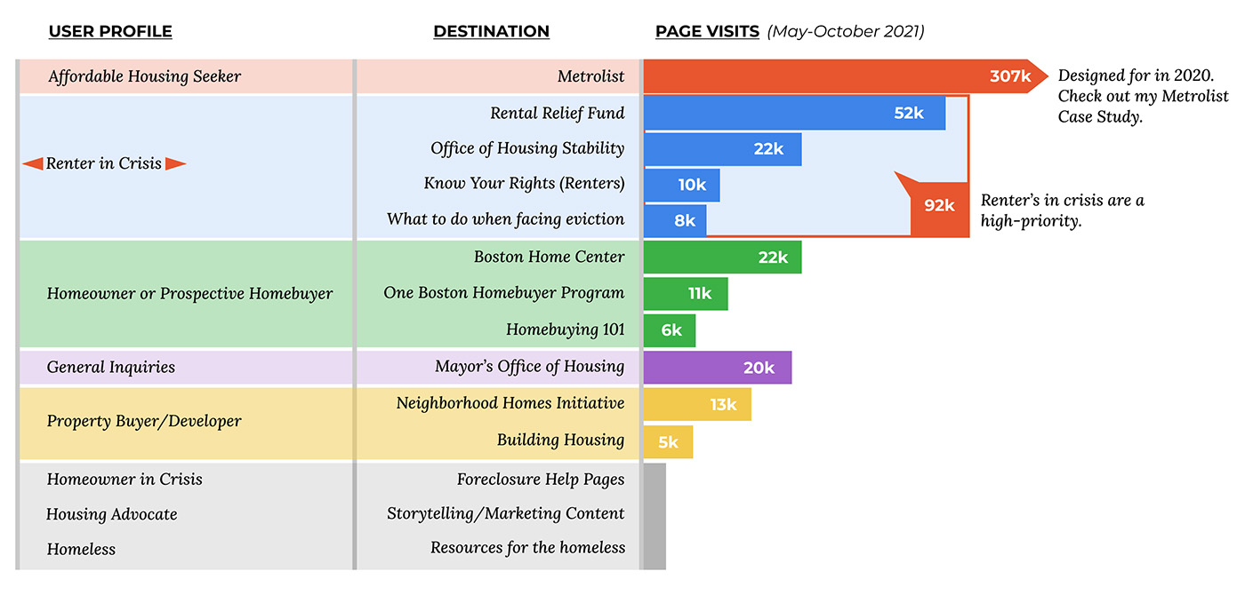
We identified six core groups of users and found clear priorities.
First things first: Who are our users and what are they looking for?
We identified six core groups of users and found clear priorities and direction.
First things first: Who are our users and what are they looking for?
We identified six core groups of users and found clear priorities and direction.
USER PROFILES
USER PROFILES
USER PROFILES
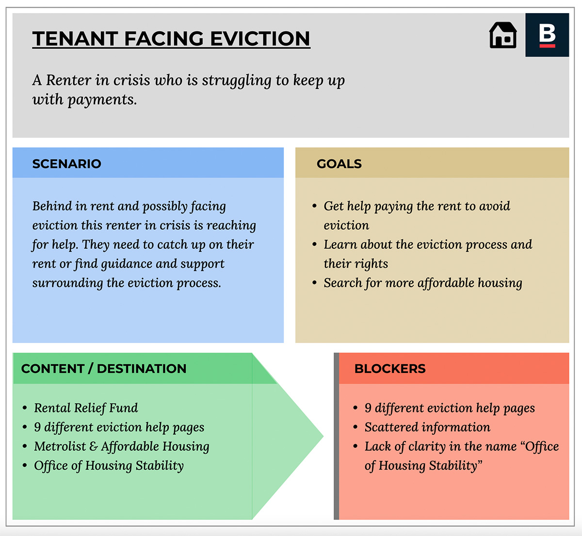
We will focus on the "Renter in Crisis?" user for this case study. Specifically those who are either faced with the possibility of eviction or who have already been evicted from their home. Assisting these residents is a leading goal for the office of housing. It requires urgency, empathy, and there is a wide array of information to convey to this user.
We will focus on the "Renter in Crisis?" user for this case study. Specifically those who are either faced with the possibility of eviction or who have already been evicted from their home. Assisting these residents is a leading goal for the office of housing. It requires urgency, empathy, and there is a wide array of information to convey to this user.
USABILITY
IMPROVING USABILITY
FINDING INFORMATION ABOUT EVICTIONS
FINDING INFORMATION ABOUT EVICTIONS
Evictions are complicated. Information was spread across numerous pages, and it was difficult to navigate whether residents had landed directly on a relevant page or began at the Housing homepage. Page layout was inconsistent, and essential links to further destinations were buried.
Residents seeking this information are in a complex and stressful position. Feeling like they are being sent in circles on the City of Boston website when seeking help ~ is no help at all.
Evictions are complicated. Information was spread across numerous pages, and it was difficult to navigate whether residents had landed directly on a relevant page or began at the Housing homepage. Page layout was inconsistent, and vital links to further destinations were buried.
Residents seeking this information are in a complex and stressful position. Feeling like they are being sent in circles on the City of Boston website when seeking help ~ is no help at all.
Evictions are complicated. Information was spread across numerous pages, and it was difficult to navigate whether residents had landed directly on a relevant page or began at the Housing homepage. Page layout was inconsistent, and essential links to further destinations were buried.
Residents seeking this information are in a complex and stressful position. Feeling like they are being sent in circles on the City of Boston website when seeking help ~ is no help at all.
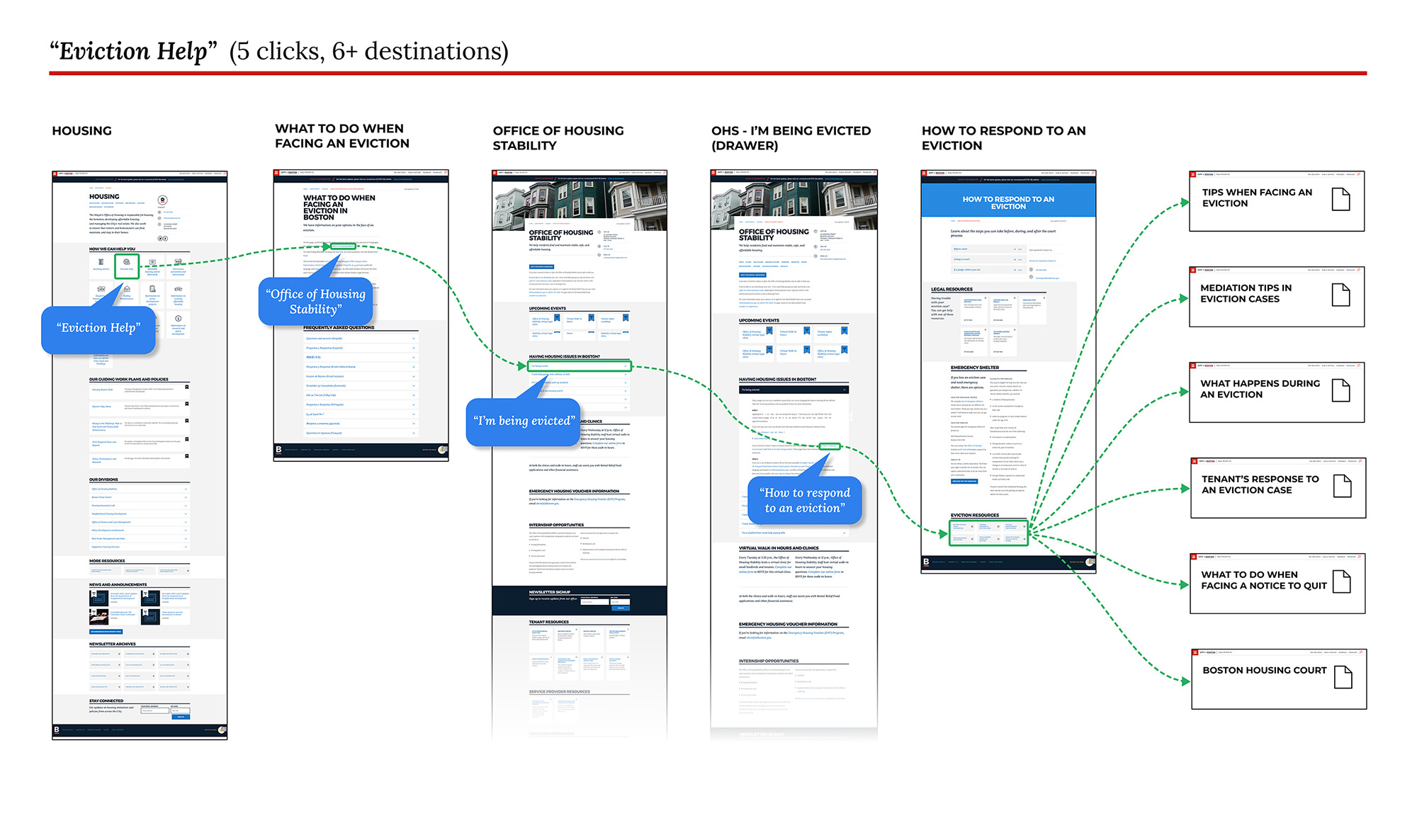
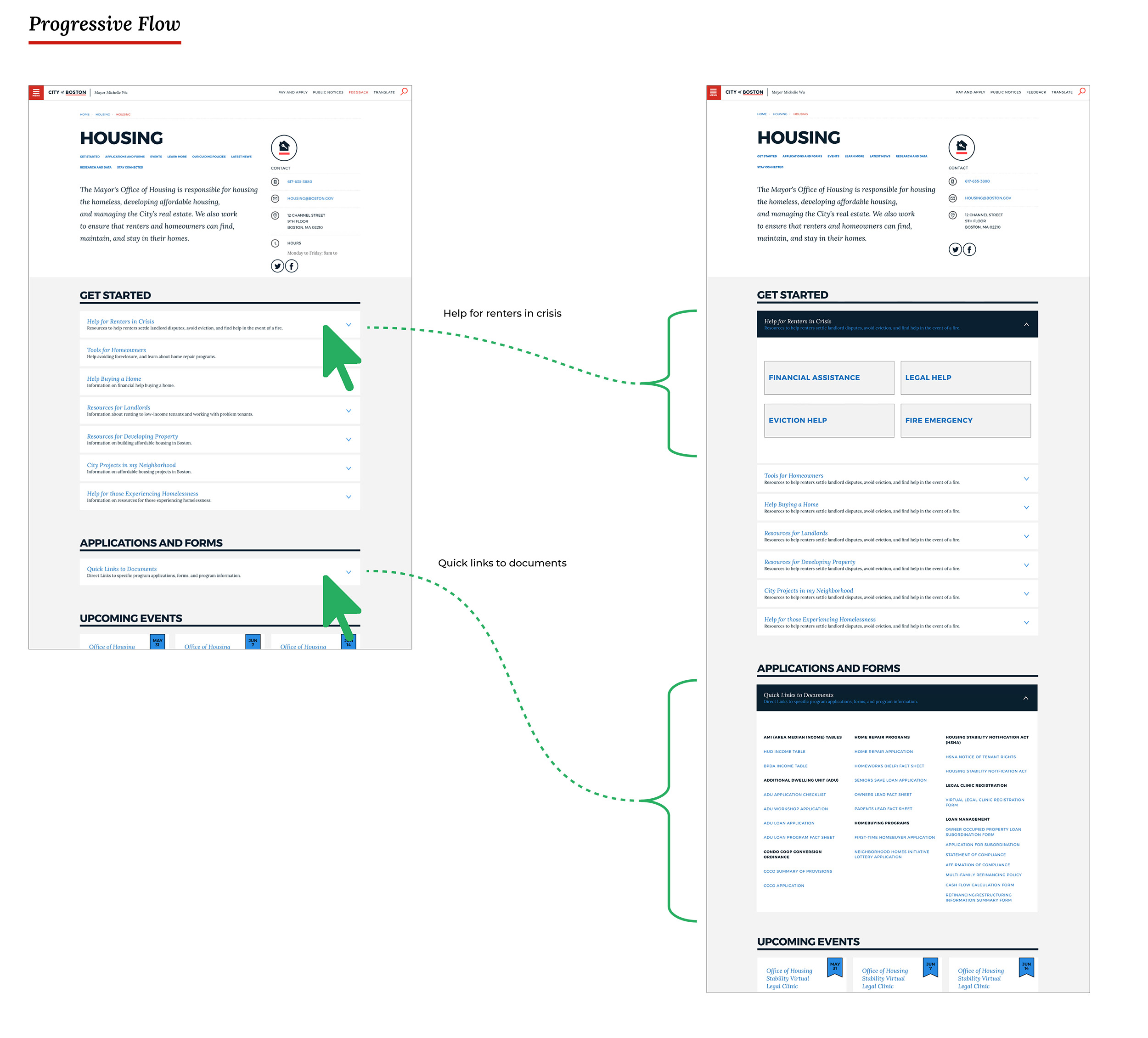
We designed one page about the eviciton process and refined the user flow. The page contains the various stages leading up to, and during an eviction within dropdowns to ease cognitive load and save space. Access to legal help and more resources are directly linked from every eviction related page.
We designed one concise page about the eviction process specifically, condensed the other relevant pages, and refined the usability across them. The eviction process page contains the various stages leading up to and during an eviction. Lengthy information is revealed within a dropdown drawer. Hiding longer text beneath a headline eases cognitive load and saves space. Access to legal help, a chief resource, is directly linked from every eviction-related page.
We designed one page about the eviciton process and refined the user flow. The page contains the various stages leading up to, and during an eviction within dropdowns to ease cognitive load and save space. Access to legal help and more resources are directly linked from every eviction related page.

OFFICE OF HOUSING HOMEPAGE
OFFICE OF HOUSING HOME
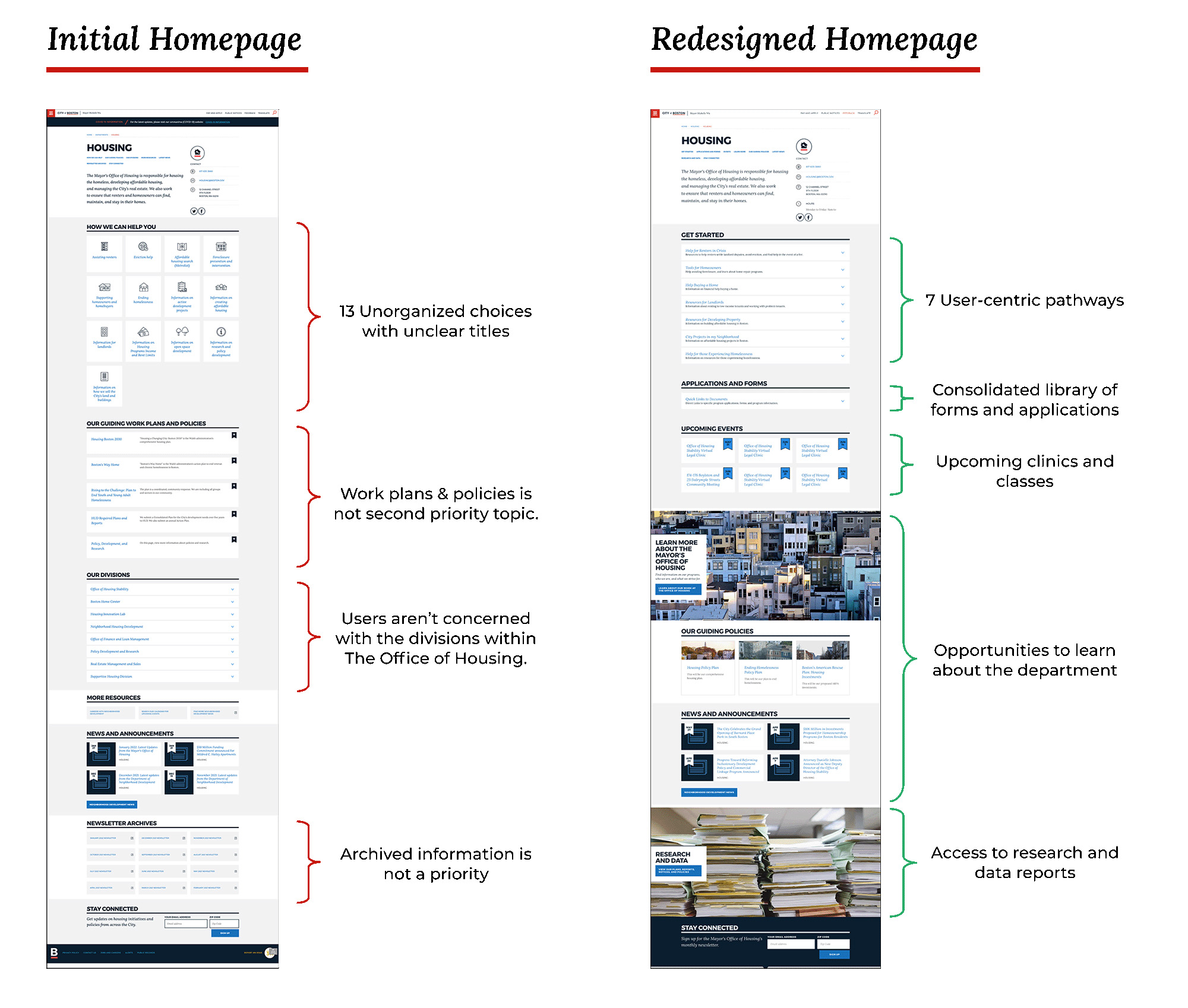
Leaning on both our user profiles and internal feedback we designed a succesful representation of the office as a whole. User-centric navigation is top level with information about the department itself and deeper resources designed in beneath that, all with clear and descritive copy.
User-centric navigation is top level with information about the department itself and deeper resources designed in beneath that, all with clear and descritive copy.
SITE ARCHITECTURE
SITE ARCHITECTURE
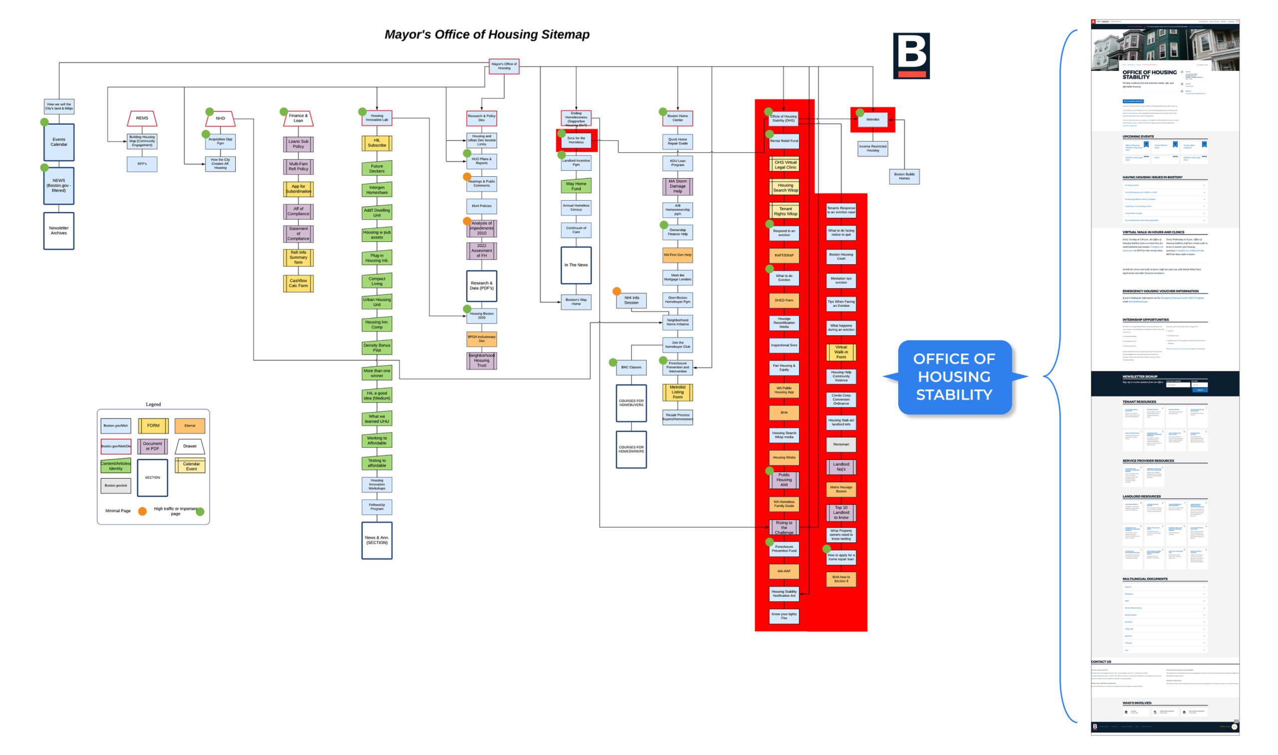
At the beginning of this project, we counted about 280 pages. We trimmed that down to 120. Mapping the site provided a baseline for understanding the existing architecture. Many of the 280 pages were outdated staff profiles and fringe entries, so we focused on what mattered the most. The information that residents need.
At the beginning of this project we counted about 280 pages. We trimmed that down to 120. Mapping the site provided a baseline for understanding the existing architecture. Many of the 280 pages were outdated staff profiles and other fringe entries so we focused on what mattered the most. The information that residents need.
PRE-EXISTING STRUCTURE
Highlighted in red are the pages that represent the information related to one particular division within the department. The most clear point of disorganization and sprawl was linked to our "Renter in Crisis" user profile.
The Office of Housing has always built its site based on the internal structure of the office. That, combined with a lack of organization surrounding page additions and its structure was redundant, inconsistent, and wasn't in step with the mindset of Boston residents.
Highlighted in red are the pages that represent the information related to one particular division within the department. The most clear point of disorganization and sprawl was linked to our "Renter in Crisis" user profile.
The Office of Housing had always built their site based on the internal structure of the office. That combined with a lack of organization surrounding page additions and the structure was redundant, inconsistenct, and wasn't in step with the mindset of Boston residents.
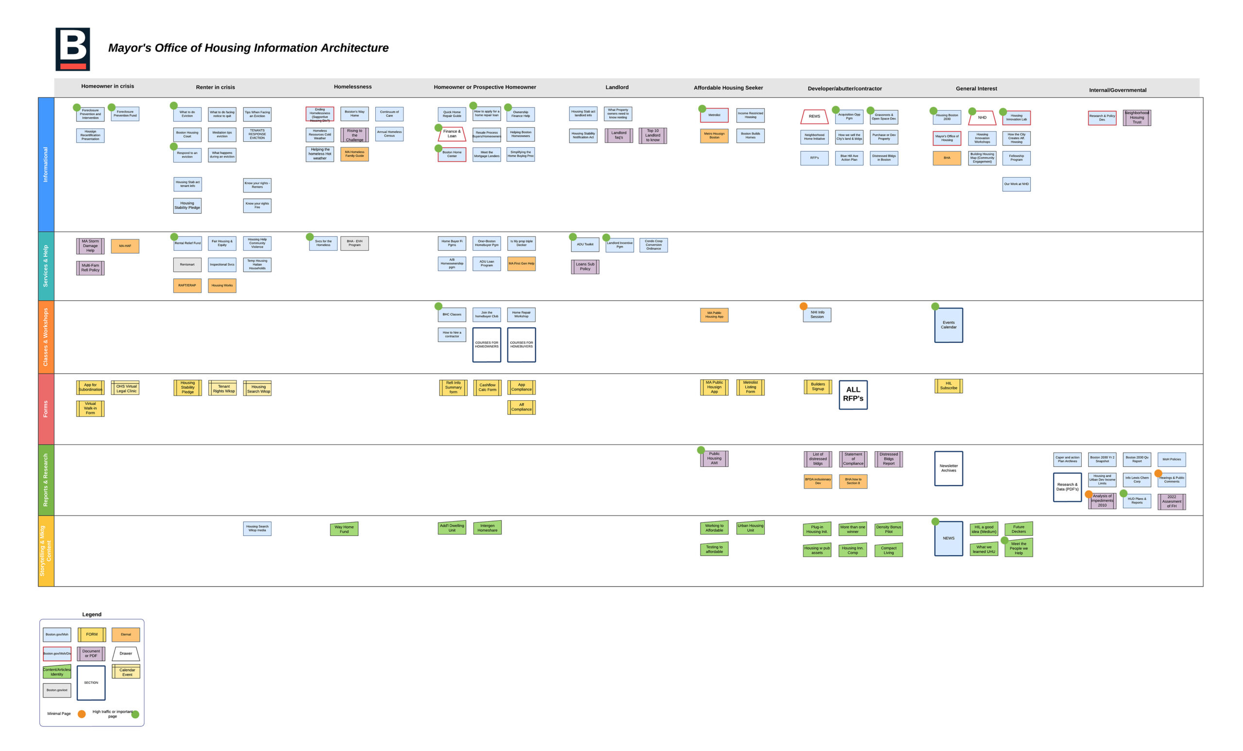
USER-CENTRIC ORGANIZATION
Once our users were defined we mapped the most critical pages by user profile, then rebuilt from there.
Once our users had been defined we mapped the most important pages by user profile, then rebuilt from there.

Mapping content by user proved to be a valuable tool for building the site architecture.
Mapping content by user proved to be a valuable tool for building the site architecture.
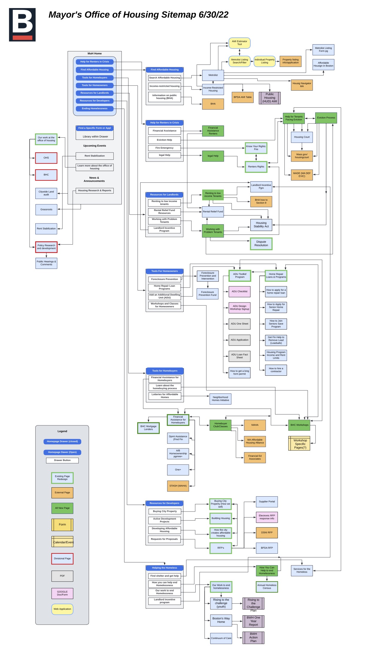
THE FINAL MAP
This final display combines our various user's pathways to information and shows the site's architecture as a whole.
This final display combines our various user's pathways to information, and shows the architecture of the site as a whole.
CONCLUSION
CONCLUSION
Every website should have a method of governance. The Office of Housing website was a perfect example of what can happen when a site lacks governance. It is more difficult to clean up a mess than prevent one in the first place. A structure to monitor the addition and subtraction of pages and information, along with a design and layout structure that can be followed when adding or editing is important.
Every website and digital product should be created and maintained, considering the user's perspective first. If you're reading this, you probably know that already, but it's a foreign concept to many, especially within government, where modern tech culture and practice might not be as well known. User-centric methodology should be outlined, exemplified, pushed, agreed to, and accomplished across our civic services.