Metrolist Boston
Metrolist Boston
Metrolist Boston
I designed, researched, and prototyped a web application to serve Boston's income-restricted housing seekers. Metrolist offers property listings, eligibility based results, filtered search results, and dynamic property attributes.
Metrolist has become one of the most visited url's at Boston.gov helping tens of thousands gain better access to housing.
Role
User Experience Designer
User Researcher
Interactive Prototyping
Information Architecture
Copywriter
Team
IT Management & C Suite
Product Owner
Back & Front End Developers
Graphic Design
Duration
8 months
Independent Contract
CHALLENGE
The real estate market is a growing challenge for Boston residents. Prices are high and many long-time residents are facing displacement. The pathway to income-restricted housing is not working for residents despite the cities’ efforts to create more housing. Users are having trouble getting timely information on the housing that’s available and the eligibility and application requirements are difficult to navigate.
GOAL
Design a web application where Boston residents can search for income-restricted housing that meets their needs, fits their eligibility, and where they can find clear information about the various programs and how to apply for them.
PRODUCT DEMO
PRODUCT DEMONSTRATION
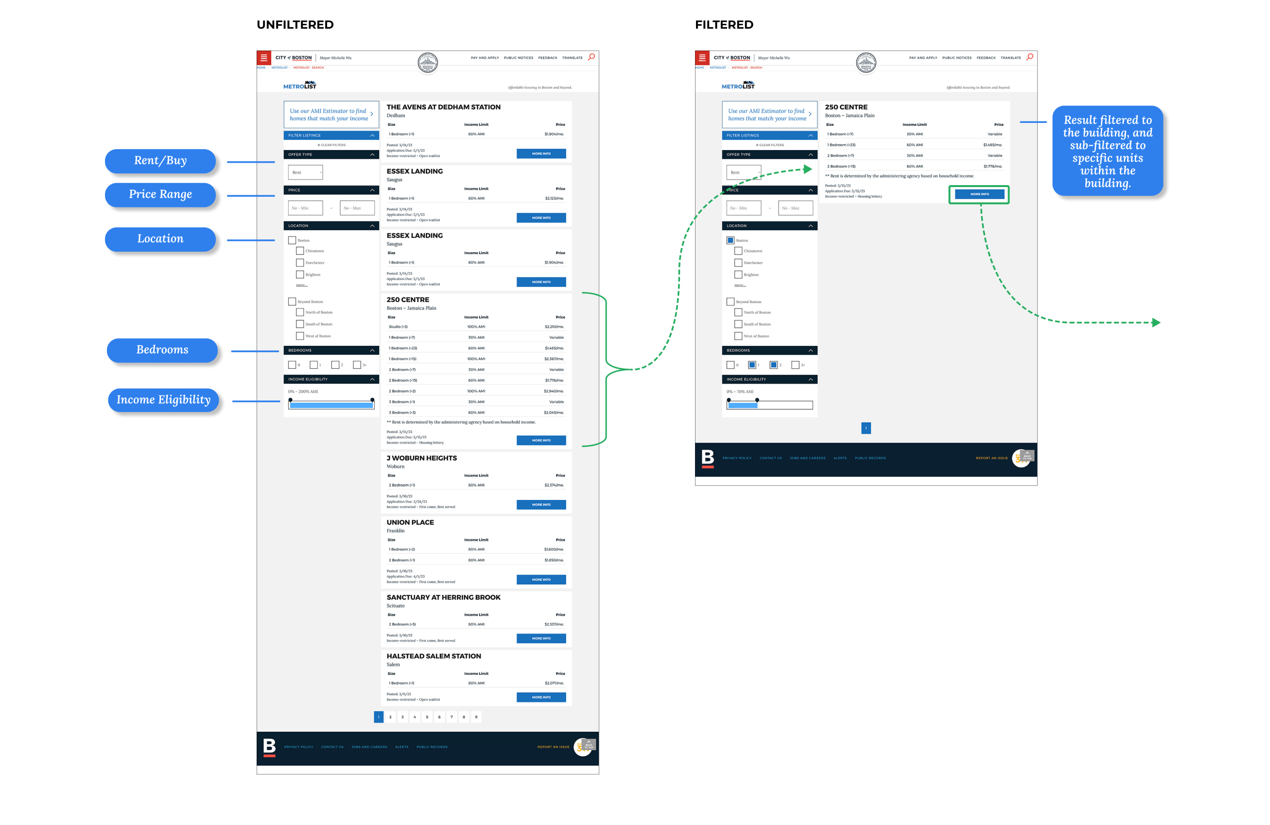
ELIGIBILITY BASED SEARCH RESULTS
FILTERED RESULTS
PROCESS
USER RESEARCH
USER RESEARCH
USER RESEARCH
User Research provided rich data and personal insight fully guiding this project.
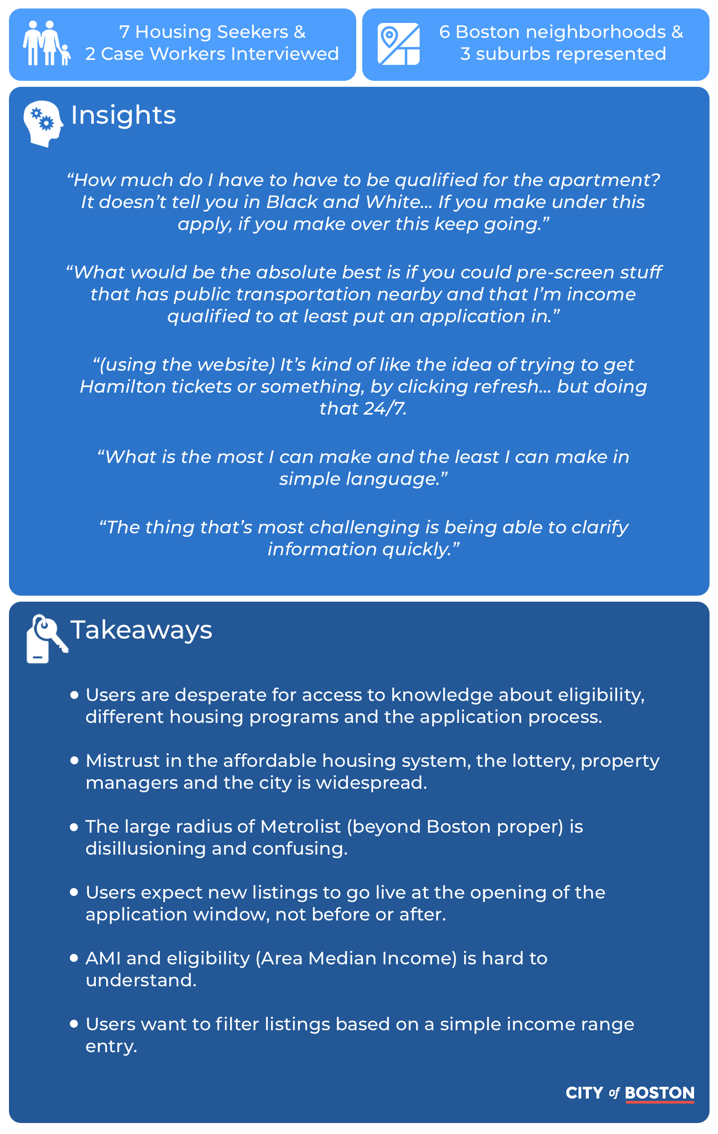
Getting to know housing seekers across Boston was an enjoyable, adventurous and very informative journey. We had the chance to connect with people in a wide variety circumstances. We met with Metrolist users varying in age, ethnicity, occupation, financial and medical circumstances. We learned about their lives, challenges, how they relate to affordable housing, their experiences navigating the system, and how they feel about it in general.
Strong, consistent themes surfaced throughout user research. User difficulties were identified across the affordable housing journey. We set out to solve as many user problems as possible with the digital product and also recommend how the affordable housing journey could be improved overall.
We gathered ground level information about user demographics, attitudes and behaviors. different races offered in the market and the issues that challenge participants as they get ready for an event. The initial survey helped us identify participants of different ages and experience levels who would be willing to participate further in our research.
USER SURVEY
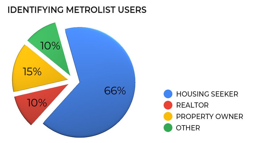
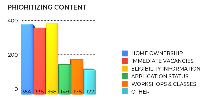
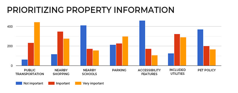
When we began "Metrolist" was an email list with about 40,000 recipients and a handful of sporadically updated webpages. Emails contained a simple list of the most recent housing made available, perhaps with a few links to agent listings. Having this mailing list allowed us to reach a large audience.
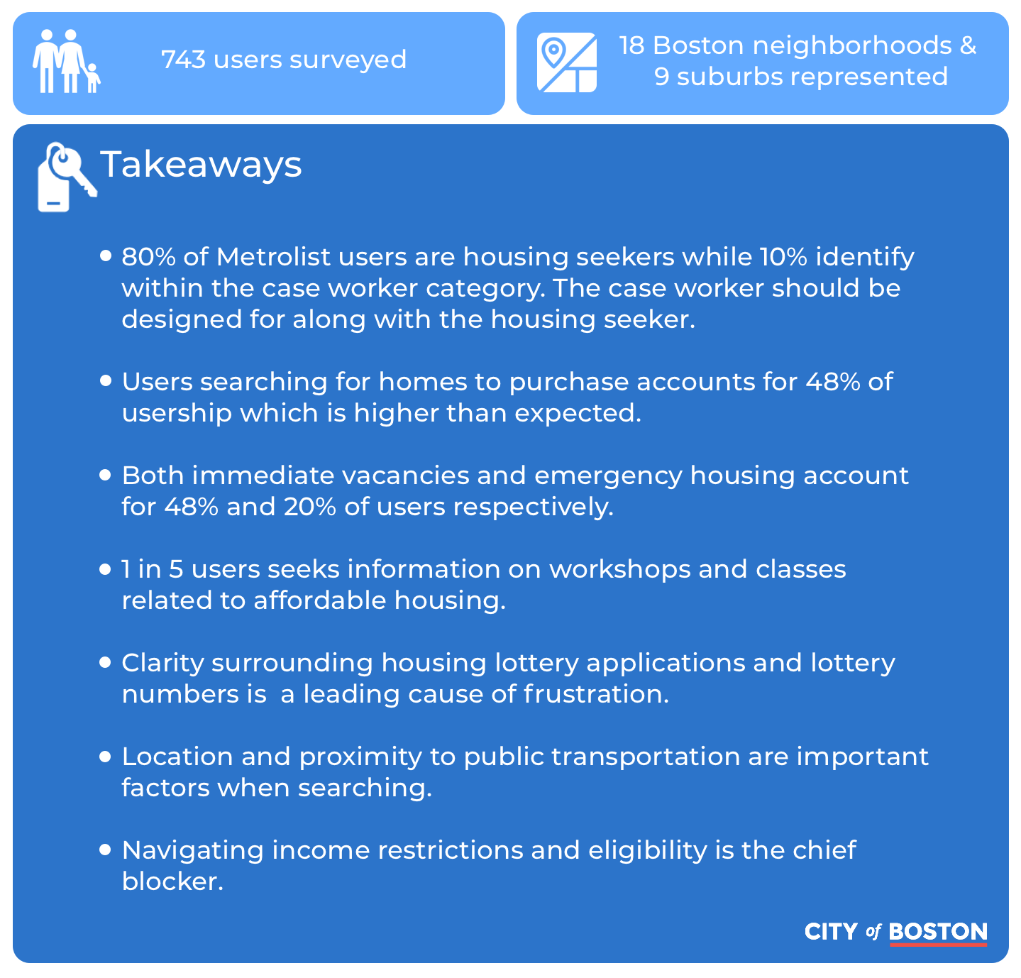
We surveyed about 750 affordable housing seekers gathering information about our users' wants, needs, feelings and attitudes through both multiple choice and text entry. The survey provided a solid foundation of data and ample opportunity to retain users who would be willing to participate further in research and usability testing.
We synthesised hundreds of written comments and objective survey data into definitive insights. We gained a significant ubnderstanding of how Metrolist users relate to the affordable housing system, and what particular aspects would be the most important ones to address.
USER INTERVIEWS
638 of our survey participants had indicated their willingness to be contacted for further participation in our research and 183 of them were willing to test new designs. We setup an online scheduling tool and were able to interview nine of our survey participants using Boston City Hall and Boston Public Library locations as available meeting places.
PRODUCT RESEARCH
PRODUCT RESEARCH
UNDERSTANDING THE AFFORDABLE HOUSING SYSTEM
The affordable housing system is unbelievably complicated. User research had showed that understanding and navigating the housing system's complexities was the chief blocker for users, and it was a challenge for our team as well. A commanding knowledge of the different housing programs, the various application processes, and of our users were all crucial to designing a solution.
In addition to a complicated application process there are various legalities related to marketing income-restricted housing. Many meetings and internal investigations were spent gathering information to forge a thorough understanding of the system as a whole and be able to convey it further to our users, and with as much simplification as possible, while adhering to strict regulations.
ANALYZING WHAT WE ALREADY HAD
Taking a high level viewpoint is a valuable way to take inventory and identify trouble spots in navigation, architecture and design inconsistency. We already had various webpages showing either basic, text entry property listings, or staggered information about programs and eligibility. I organized pages by subject matter rather than by department or program and mapped the pathways to reach important content. I discovered that affordable housing was spread accross numerous departments and the pathways leading to the most important information were often buried. page layout was also very inconsistent.
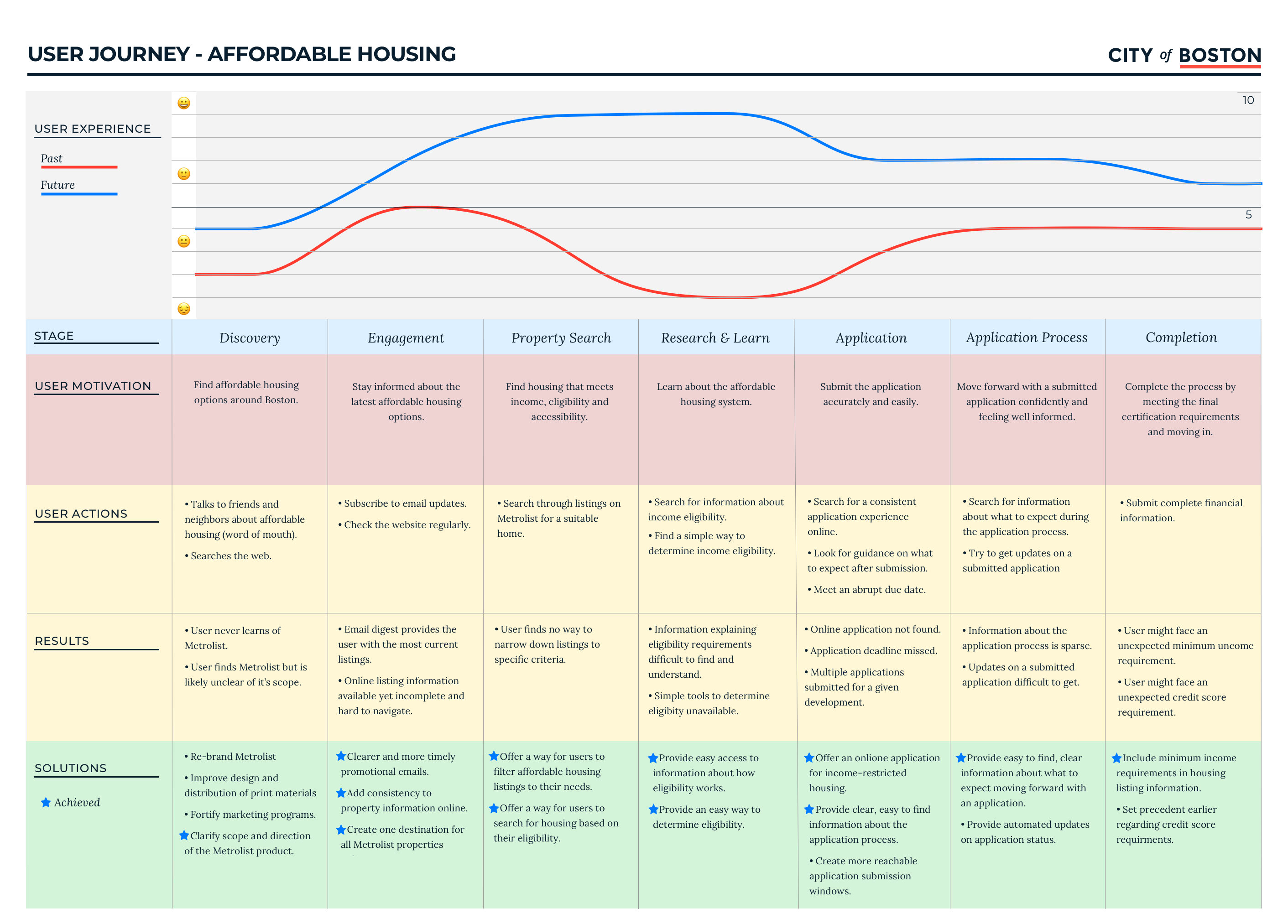
USER JOURNEY
All of our research helped us reach a rich and detailed User Journey Map showing the realistic improvement foreseen across the experience.
All of our research helped us reach a rich and detailed User Journey Map showing the realistic improvement foreseen across the experience.
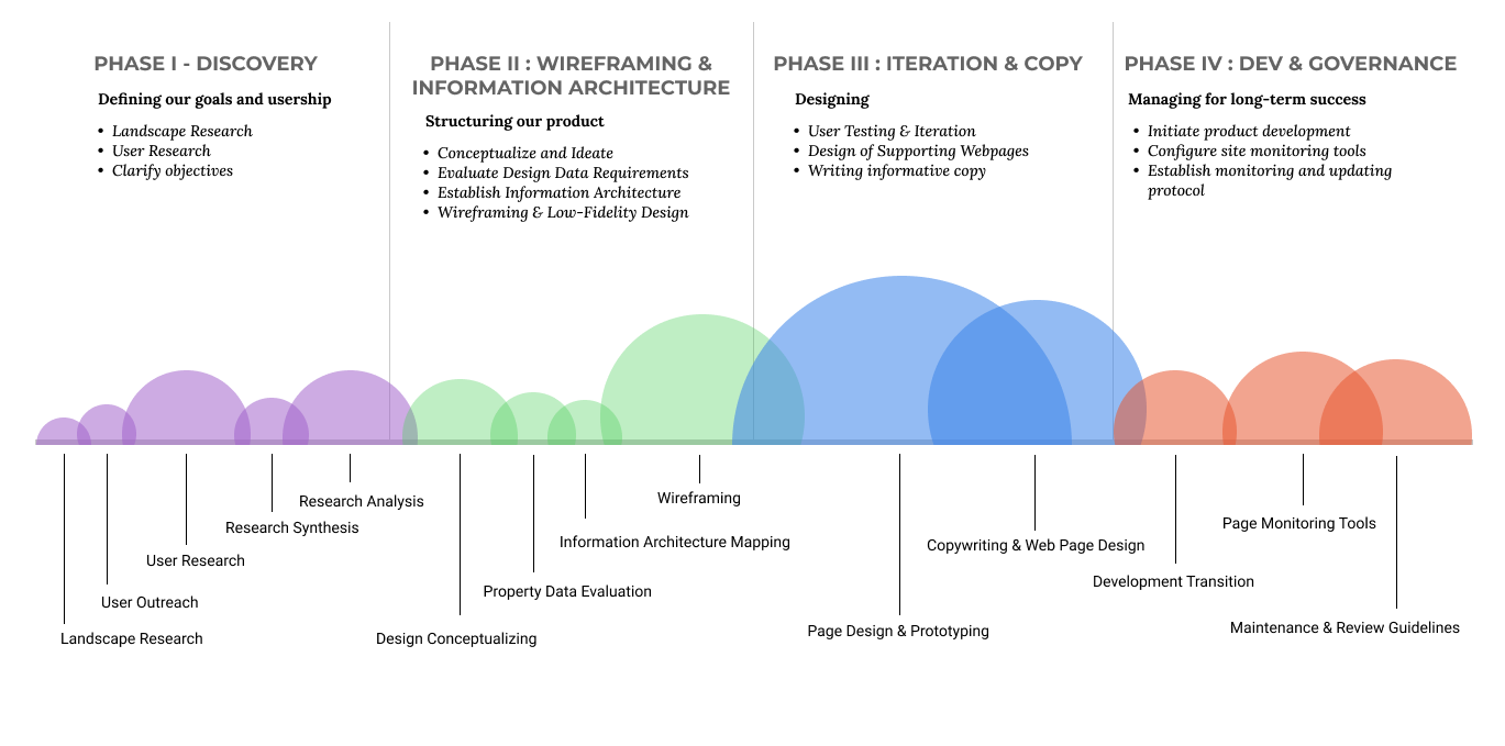
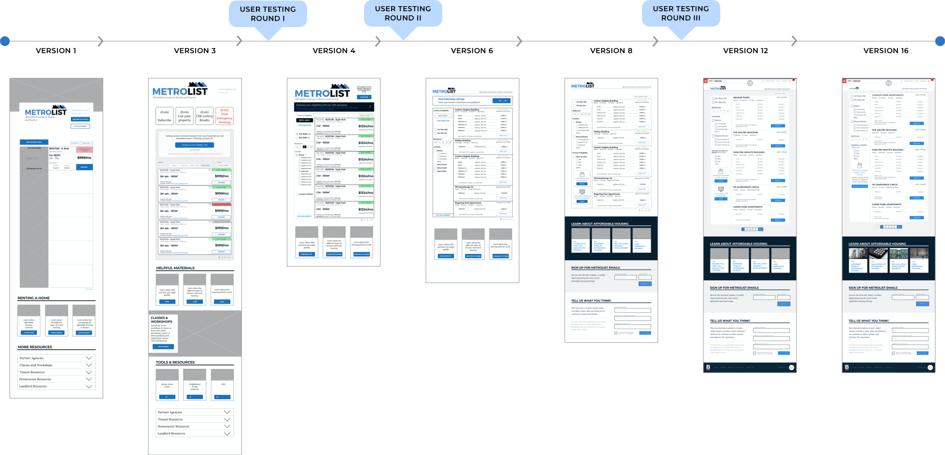
PROTOTYPING & ITERATIONS
DESIGN & ITERATION
Numerous design constraints played a role in shaping Metrolist. Boston.gov is built and managed on the Drupal CMS with a library of pre-programmed components. We were tasked with utilizing as many of those pre-formatted components as possible, and also with designing an entirely new web applicationto be housed within those pages.
One of the most noticeable things about Metrolist is the absence of both property photos and an interactive map. Both features are standard in the consumer space but they were ruled out early for this design. Timely access to quality, consistent photos is a challenge and properties that do have quality photography almost always provide a URL where it can be found.
User testing also supported the direction of leaving photography out of the design. Users like to see photos but they are more inclined to focus on hard data when it comes to income-restricted listings.
The prospect of an interactive map also raised issues. Accessibility being one, along with the increased lift it would pose for development.
Leaving both photos and the map out of the design simplified needs internally, added consistency to the design format, and didn't pose a significant blocker for our users.
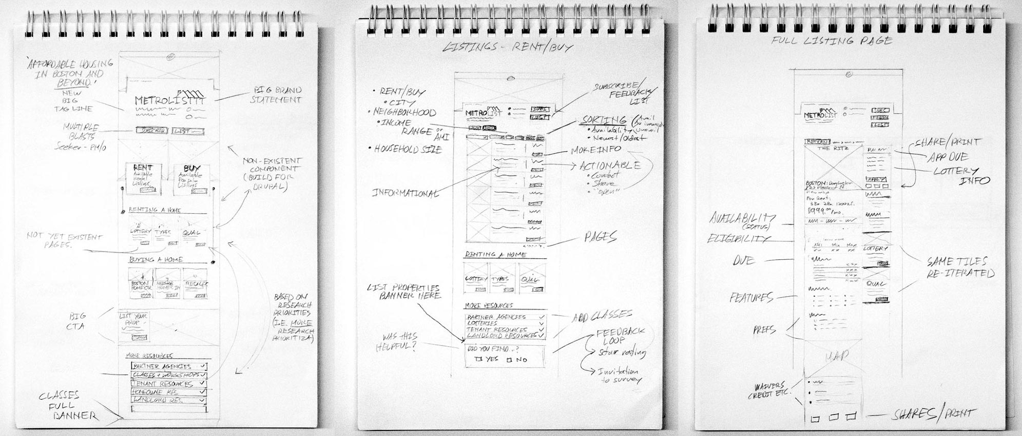
IDEATION & SKETCHES
USER TESTING
FINAL DESIGN
FINAL DESIGN
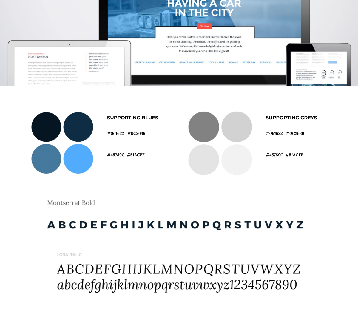
BRAND GUIDELINES
The City of Boston has specific, published brand guidelines and design parameters covering colors, typefaces, and beyond. We adhered to these guidelines tightly in our prototype to make sure we delivered what developers could be encouraged to stay faithful to.
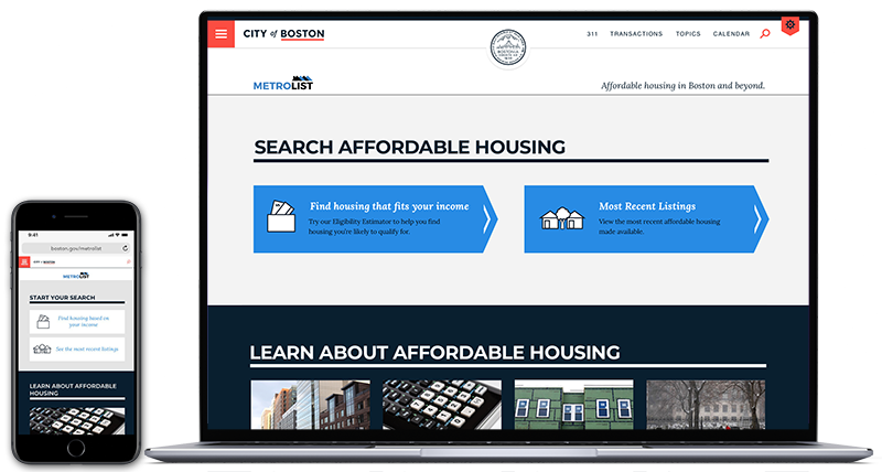
Beginning at the Metrolist homepage users have the option to either view the most recent listings or use an eligibility caluculator to reach tailored choices. They also have the option to explore various educational topics, sign up for the email list, find workshops and classes, and those looking to list their property can click into the property listing form. Through either pathway the user reaches property thumbnails they can filter based on their leading priorities. Both the filters and thumbnail information is designed around user research and structure as determined by our dataset and information architecture. They also have the option to use the eligibility calculator or explore educational content from this page.
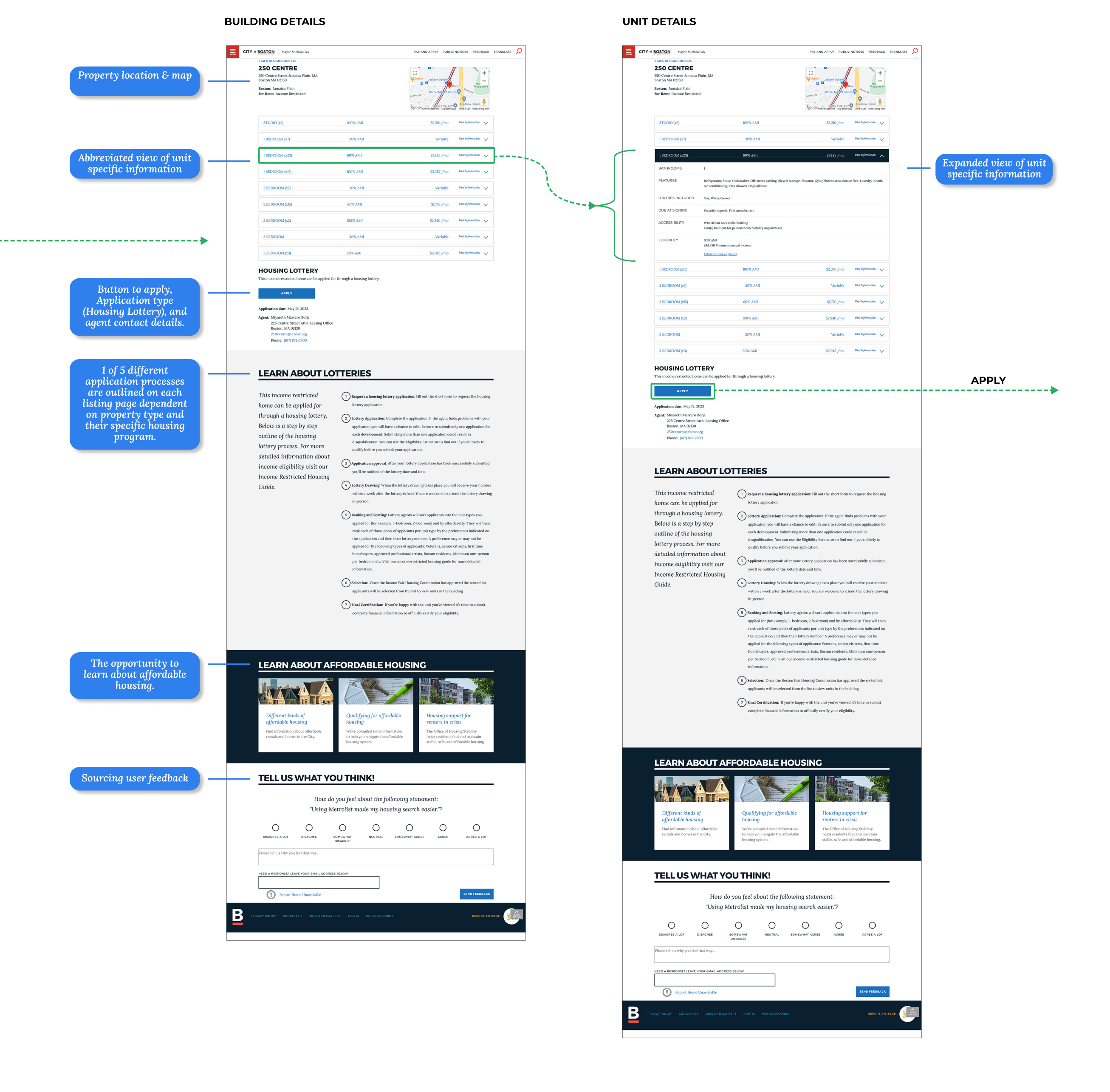
When opting to learn more about a particular listing users reach the full listing detail page. It was important to keep individual units nested within their housing development. There can be many units within a given development and more importantly; applications are submitted by development rather than by unit. A guide to the application process is included. The application process varies between five possible styles based on different property types.
FILTER AND VIEW LISTINGS
Beginning at the Metrolist homepage users have the option to either view the most recent listings or use an eligibility caluculator to reach tailored choices. They also have the option to explore various educational topics, sign up for the email list, find workshops and classes, and those looking to list their property can click into the property listing form. Through either pathway the user reaches property thumbnails they can filter based on their leading priorities. Both the filters and thumbnail information is designed around user research and structure as determined by our dataset and information architecture. They also have the option to use the eligibility calculator or explore educational content from this page.
When opting to learn more about a particular listing users reach the full listing detail page. It was important to keep individual units nested within their housing development. There can be many units within a given development and more importantly; applications are submitted by development rather than by unit. A guide to the application process is included. The application process varies between five possible styles based on different property types.
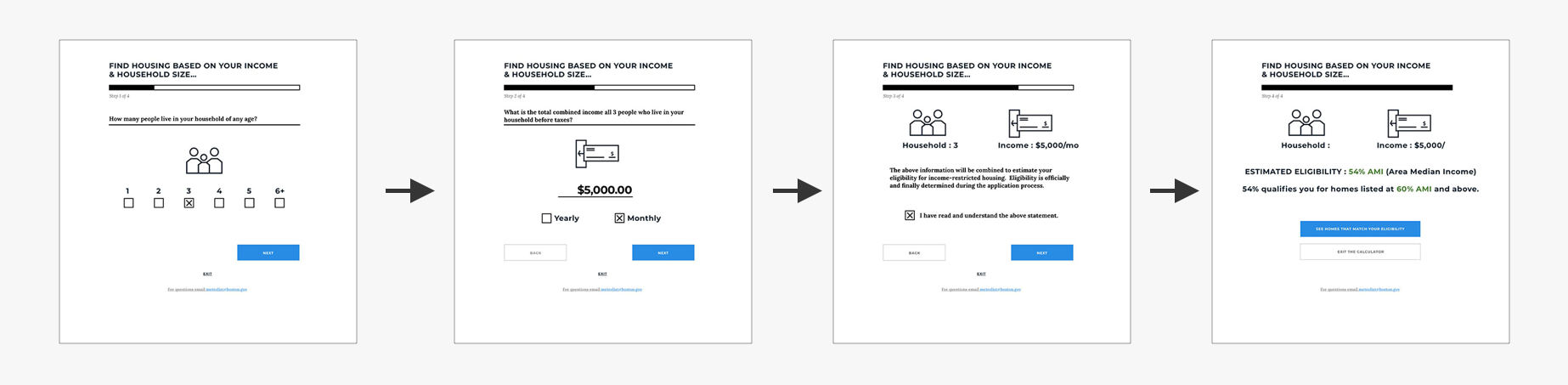
ELIGIBILITY CALCULATOR
Users can enter their information to get a quick idea of their eligibility without having to master the complex affordable housing system. The premium feature of Metrolist is what we call the Eligibility Estimator tool. An eligibility calculator that serves up tailored choices. I designed a four step progressive flow simplifying the process as much as possible.
Users can enter their information to get a quick idea of their eligibility without having to master the complex affordable housing system. The premium feature of Metrolist is what we call the Eligibility Estimator tool. An eligibility calculator that serves up tailored choices. I designed a four step progressive flow simplifying the process as much as possible.
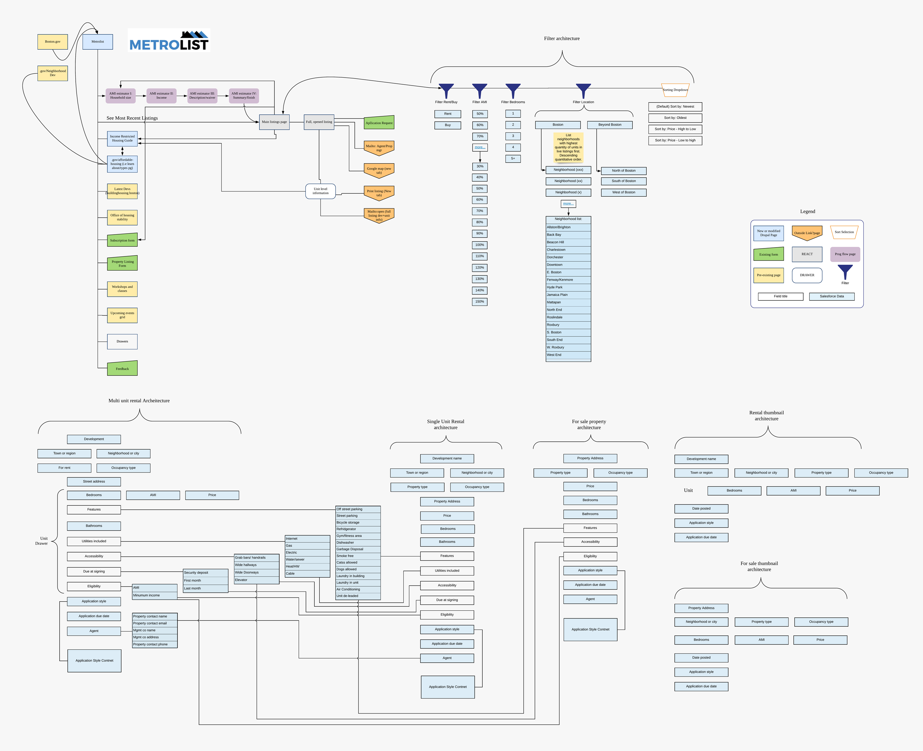
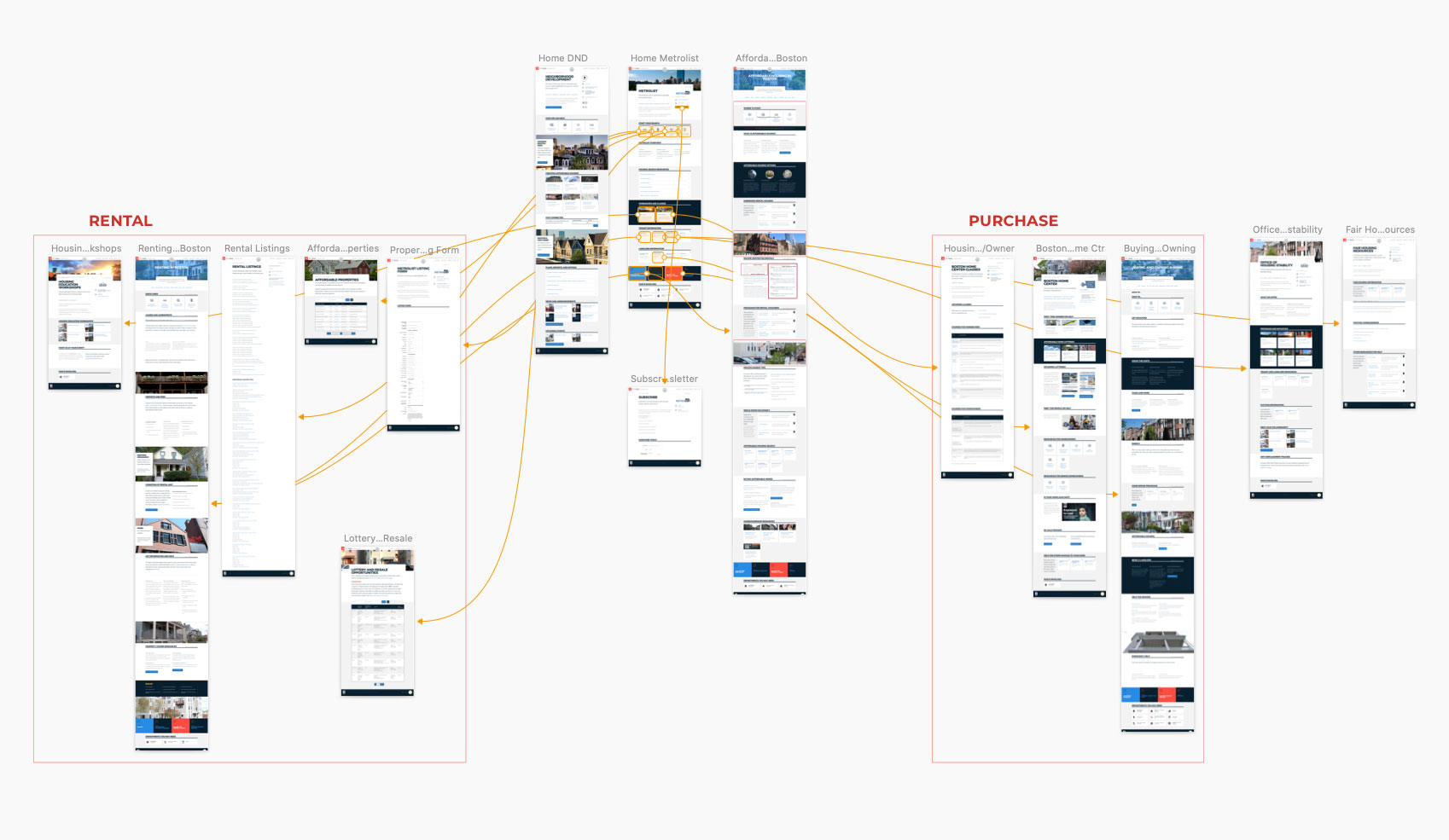
SITEMAP & INFORMATION ARCHITECTURE
I am as proud of this map as I am any aspect of this project. There are many iterations. It was an ongoing challenge to organize listing data into a design that suits both sale and rental homes, listings either rich or scarce in data, listings holding just one unit vs numerous units, and listings that connect to one of a vqriety of programs and application types.
Research showed clear trends in our users' priorities that influenced this structure along with industry standards. Location, property type, price, and the eligibility requirement were highest level. Our internal dataset was also evolving over the course of the project. It was routinely revisited, updated and then integrated into the information architecture of the design.